

July 1, 2026
Three real B2B design examples—a social carousel, a concept infographic, and a research report—and the job each was built to do.

This article is part of a series in which we round up great examples of classic types of content. You can go deeper with our examples of case studies, B2B thought leadership, content strategies, pillar pages, and benchmark reports.
A lot of roundups of B2B design examples are just eye candy—grids of gradient decks and clever landing pages, scored on how they look. Which is fine! Until you remember that the design sitting on your content calendar isn't there to win a beauty contest; it's there to distribute an idea, and to turn that idea into revenue (eventually).
So instead of a gallery, here are three B2B SaaS design examples we can actually explain, because we made them. These are all previous Campfire Labs' client projects, and we're using them because we can tell you why each design decision got made, not just point at it and nod.
Data reports can pose specific design challenges. The info is dense, the scope can be overwhelming (oh yay, another 100-page PDF to read, said no one ever…), and the reader needs a lot of visual assistance to glean the takeaways at a glance.
With Vena's 2026 FP&A Impact Report, we aimed to build usability and simplicity into a complex topic and in-depth data.
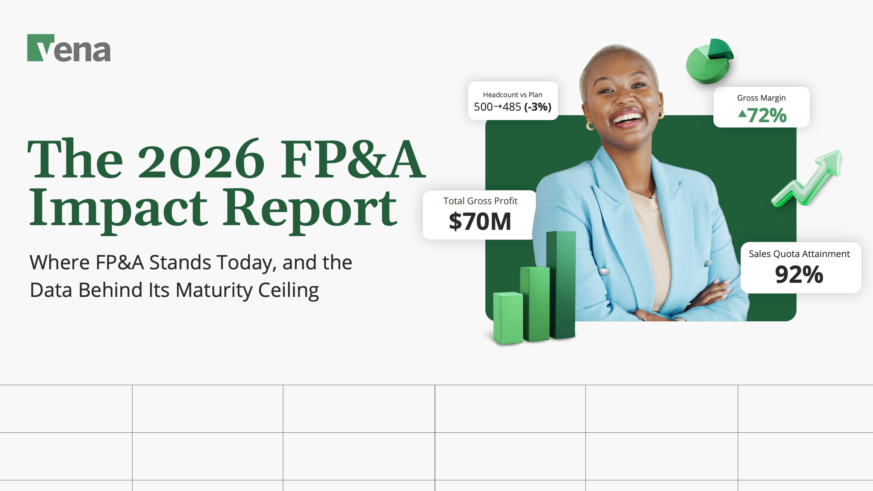
We applied that philosophy right from the cover. The title sits next to floating stat callouts—Total Gross Profit $70M, Gross Margin 72%, Sales Quota Attainment 92%—so the report signals "real numbers, real rigor" at first glance.
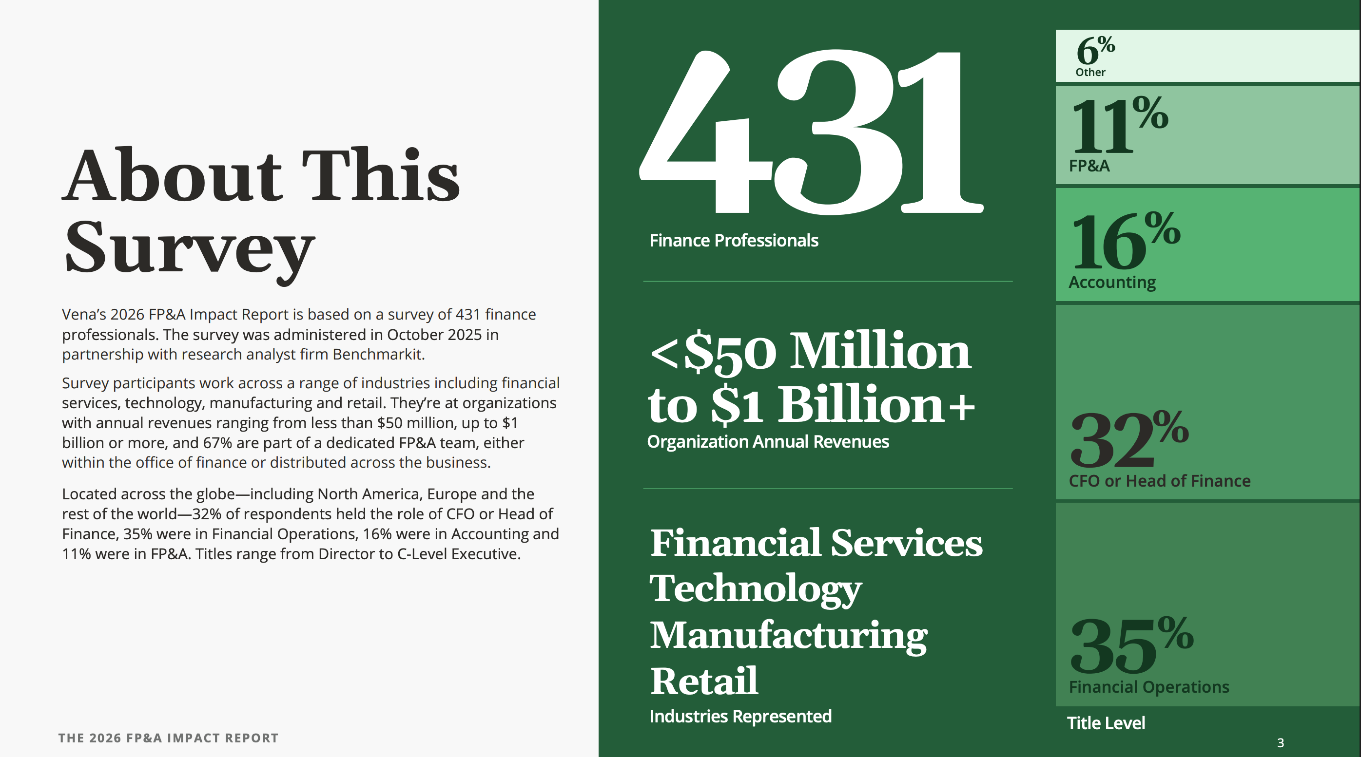
The "About This Survey" spread turns the methodology itself into a data visualization: 431 respondents, revenue bands from under $50M to $1B+, a clean breakdown of titles and industries.
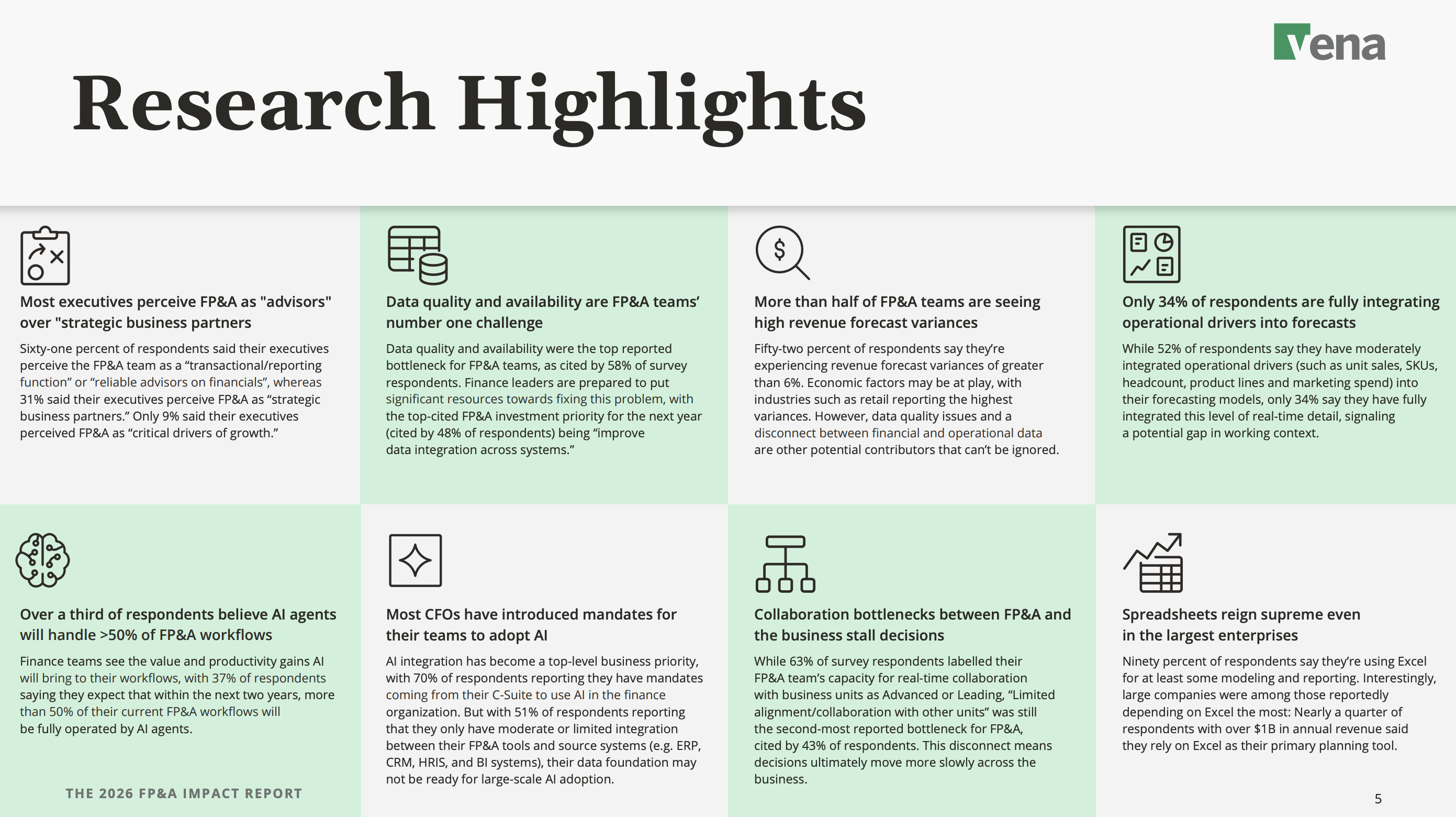
The Research Highlights page is built to be skimmed, showing eight findings, each in its own tile with an icon, a bolded headline, and one tight paragraph. This section is also designed to be easily recycled into pull quotes for a LinkedIn post or a sales slide.
Book a call with our CEO to discuss your next B2B design project
Social is where good ideas go to get ignored. Attention is measured in fractions of a second, and a lot of B2B creative can end up looking like a brochure.
For Elephant Energy, a clean-energy company selling home heat pumps, we built a four-slide carousel with one idea per slide, and focused on telling a real customer story.
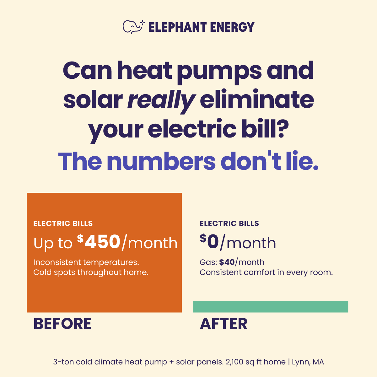
The design job here wasn't to look premium, because that can give off too much of a polished 'ad' feel for social content. Instead, we tried to bring authenticity and homey vibes to the asset, while still showing Elephant Energy's professionalism.
Some products are easy to explain, whereas others are complex, niche, or high-tech. Netradyne sits in the second camp.
Their fleet-safety platform is incredibly sophisticated: AI-powered in-vehicle alerts, analysis of 100% of driving time, a driver-facing safety score, video telematics, compliance reporting… It's easy for their content to turn into a feature list because they've got so much going on.
Luckily, their core messaging is clear: while others scratch the surface, we go deeper. We built the visual story as an iceberg.
.pptx%20(1).png)
Above the waterline, we show the surface-level safety metrics competitors stop at. Below it, the complexity: comprehensive analysis, positive reinforcement in the GreenZone, full context and reporting, the depth that makes the product different.
Book a call with our CEO to discuss your next B2B design project
Three different formats—a data report, carousel, and a concept infographic—doing three different jobs. But the process was identical: decide what the piece is for, then let that decision drive every choice on the page.
The Vena report had to be credible, so the rigor went up front and every highlight got built to be lifted and quoted. The Elephant Energy carousel had to standout in the LinkedIn and Instagram feed, so anything that didn't serve the customer story got cut. The iceberg had to make "deeper" visible, so the metaphor became the layout.
Before your next asset goes to a designer, we recommend writing out one sentence: the job of this piece is to ___. A great-looking asset with no job is just an expensive way to fill a content calendar. But get the job right, and the design finally has something to be good at.
Subscribe to our newsletters for insights, ideas, and perspectives from the brightest minds in marketing, delivered straight to your inbox.